
Panorama: designing a complex financial product
Overview
Panorama is a strategic initiative aimed at enabling customers to better understand and optimise their finances through a holistic, forward-looking perspective.
Originally developed as an advisor-led tool, Panorama allowed financial advisors to guide customers through their overall financial situation and provide tailored recommendations.
I joined the project as the main designer responsible for shaping the mobile experience, contributing across exploration, concept development, and product definition.
The project was highly visible across the organisation and widely discussed, evolving through multiple pivots and strategic shifts.
Disclaimer: Due to confidentiality constraints, only publicly released screens are shown. Additional concepts, iterations, and more advanced explorations cannot be shared, but played a key role in shaping the direction of the product.
The version currently available represents an early production step and reflects only a fraction of the broader concept explored during the project.
Challenge
This was not a traditional UX problem with a clearly defined scope. It was a product space that was still being formed.
Panorama had been built for advisors, where complexity is handled through conversation. Bringing that into a product meant shifting the responsibility into the interface itself.
At the same time, the domain was inherently complex. Financial planning involves abstract concepts, long-term thinking, and interconnected decisions that are difficult to communicate clearly. Designing in this space required more than interface work — it required understanding the underlying logic.
On top of that, the direction of the product was constantly evolving. Strategic input, priorities, and assumptions changed over time. Rather than working toward a fixed solution, the work involved continuously redefining what the product should be.
The challenge became less about solving a single problem, and more about navigating a moving one.
Solution
My approach focused on using structured creativity and experimentation to bring clarity to the product.
Key contributions:
Explored and iterated on different ways to simplify complex financial information
Contributed to shaping a more coherent and understandable experience across touchpoints
Helped translate abstract financial logic into tangible UI concepts
Supported alignment across stakeholders by making ideas visible and testable
Role
Product Designer
Timeline
1.5 years
Team
Cross-functional product team (designers, business analysts, developers)
Tools
Figma
My role
As the main designer on the experience, I was responsible for driving design forward in an environment where direction was often unclear.
My work focused on three main areas:
Exploration — turning abstract ideas and discussions into tangible design concepts
Translation — making complex financial logic understandable and structured
Alignment — using design to help teams reach clarity and direction
Over time, I became a key creative driver within the project, helping shape not just how the interface looked, but how the experience was understood.
Working in Ambiguity
A defining aspect of the project was the level of change.
The concept of Panorama evolved through multiple pivots and strategic steers, which meant that design work was rarely linear. Directions would be explored, revisited, or replaced as new insights emerged.
Instead of aiming for stability, I focused on maintaining momentum. This meant:
Quickly adapting to new inputs
Reframing concepts when direction shifted
Ensuring the experience remained coherent despite change
Design became a way to navigate uncertainty. By making ideas visible, it allowed stakeholders to align, challenge assumptions, and move forward.
Approach
To operate effectively in this space, I had to go beyond interface work.
A key part of the process was developing a strong understanding of the domain - how financial recommendations were structured, how advisors communicated them, and what made them meaningful to customers. This allowed design decisions to be grounded in reality rather than abstraction.
At the same time, I relied heavily on exploration. Instead of waiting for clarity, I used design to create it. Concepts were used to test directions, frame discussions, and enable better decision-making.
Workshops were a central part of this process. I participated in numerous internal sessions where ideas were explored and refined, as well as collaborative workshops with the external vendor building the new mobile app. These were not passive alignment meetings, but active working sessions where design directly supported communication.
In this context, communication became a core part of the design work, not something separate from it.
Shaping the product
My contribution was not limited to individual screens or flows, but to shaping how Panorama could take form as a product.
This involved translating an experience originally designed for human interaction into something that could be understood within a digital interface. It required structuring complexity, defining boundaries, and making abstract ideas more accessible.
Key aspects of this work included:
Translating advisory logic into clear, structured product flows
Defining how financial topics could be grouped and presented
Helping the team move from abstract discussions to concrete direction
Over time, this contributed to a more tangible understanding of the experience, even as the broader concept continued to evolve.
Production outcome
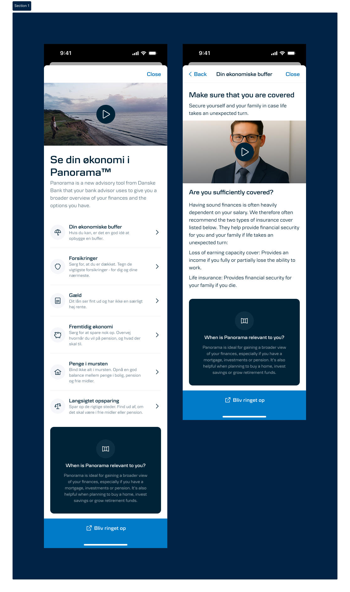
The version currently available in the mobile app represents an initial implementation derived from a broader set of explorations.
It introduces Panorama in a simplified form, focusing on making the concept understandable and accessible within the existing banking experience. The flow is structured to guide users through key financial topics and encourage further engagement with advisory services.
While intentionally limited in scope, this version reflects only a portion of the work explored during the project. Much of the design effort focused on more advanced directions that are not publicly shareable.
Impact
The initial release proved effective in its role.
It increased awareness of Panorama and led to a noticeable rise in users booking meetings with advisors.
As one advisor described it:
“We used to get maybe a couple of sign-ups a week. Now we’re getting a lot each day.”
This demonstrated both the relevance of the concept and the value of introducing it in a structured and accessible way.
Takeaways
This project reinforced that designing in complex domains is not just about execution, but about navigation.
Design can be used to create clarity when direction is unclear
Deep understanding of the problem space is critical to meaningful solutions
Communication and alignment are integral parts of the design process
Ultimately, the work was not about delivering a fixed solution, but about shaping something that continues to evolve.